Official Release of LyteNyte Grid v1.0
A New Era for React Data Grids and Powerful Data Tables
RoarLyte - 26 August 2026 (5min)
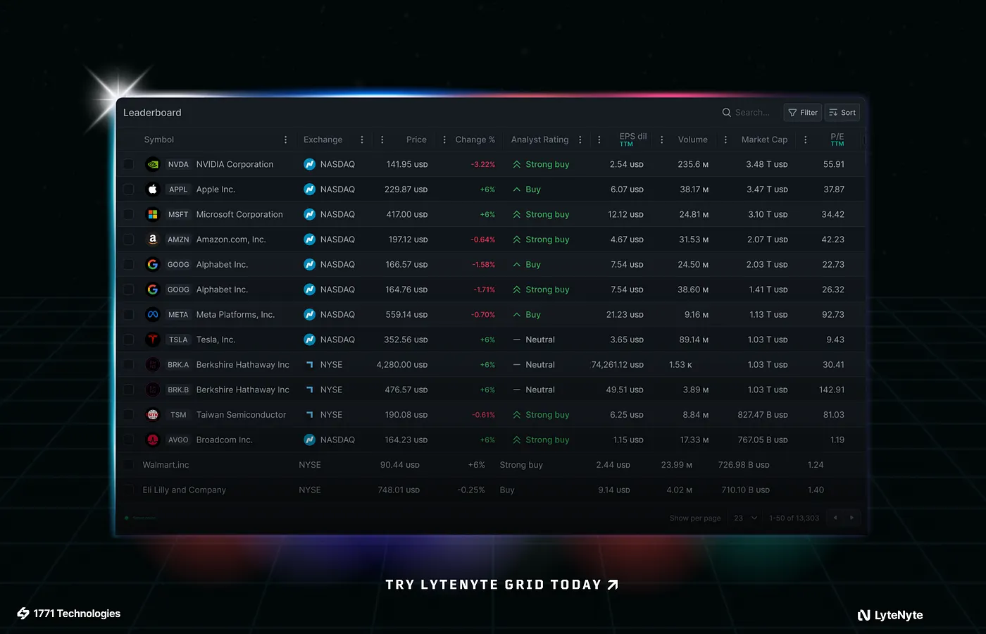
A few months ago, we announced the beta release of LyteNyte Grid, a lightning-fast React data grid. Today, we are announcing the release of the massively improved LyteNyte Grid 1.0, which is faster, leaner, and more capable than ever before.
We built LyteNyte Grid 1.0 to survive the things that make other grids collapse, so whether you’re managing tables with millions of rows or supercharging your application with real-time data updates, LyteNyte Grid will redefine your grid expectations.
If you’re unfamiliar with LyteNyte Grid, stop reading. Go check out the demo, clone us on GitHub, or walk through the getting started guide. All our source code is public.
What’s New in LyteNyte Grid 1.0?
Better Type Interfaces
- Every aspect of the Grid has a type
- Every type has a doc comment explaining
50% Smaller Bundle Size
- Core: 36kb. PRO at 49kb. No, that’s not a typo!
Game-Changing Headless Component
- Use our pre-styled themes or drop into full headless mode for 100% control
- Fully compatible with React’s concurrent mode and new compiler
If you need a free, open-source data grid (Core) or are shipping enterprise-scale applications that demand advanced features and support (PRO), LyteNyte Grid 1.0 has you covered.
One grid, two editions. Both are built for developers who value performance, clarity, and control.
If you care about speed, bundle size, flexibility, and an unopinionated API, LyteNyte Grid is the only option.

Better Type Interfaces
Version 1.0 focused specifically on improving the LyteNyte Grid API interface and ensuring we can flexibly add features without causing breaking changes in the future.
- Stabilized the API interface
- Improved our type docs
- Enhanced the TypeScript support of both Core and PRO versions of LyteNyte Grid, increasing the compatibility between the two
Closer type integration between Core and PRO means users can start with the Core edition of LyteNyte Grid, and if (or when) they need some of the advanced features of PRO, the code changes will be kept to a minimum. No pressure, though, our Core edition is a powerhouse, and for many of the simpler data table use cases, such as sorting, filtering, resizing, and column moving, Core is all you will ever need.
We really took the time to improve the API consistency and usability. Our new API is a shallow interface but covers a deep range of features that match and, in many cases, far exceed the capabilities of other data grids.
- Events can now be prevented, and we’ve enforced stronger declarative constraints for nearly every part of the grid. It works with React the way React expects it to
- Reworked the internal state management so it’s compatible with React’s concurrent mode
- LyteNyte Grid’s declarative state is also fully compatible with React’s new compiler. No configuration necessary
Halved The Bundle Size
We cut the total bundle size of LyteNyte Grid in half. With trees shaking enabled, LyteNyte Grid Core edition comes in at just 36kb gzipped (43kb with extras). The PRO edition, with all the advanced features and with tree shaking, clocks in between 49kb and 65kb.
For context, these numbers are ridiculously small. Other data grids with a similar feature set weigh 4-7x more.
These numbers exceeded our expectations. Our Core edition (free for the community), at just 36kb, still supports row and column virtualization, pagination, row selection, column moving, row dragging, column resizing, master-detail views, full-width rows, column and row spanning, and more.
The kicker? Even though LyteNyte Grid 1.0 is already the most feature-rich data grid at the smallest bundle size, we know we can make it smaller. Future versions of LyteNyte Grid will push the bundle size down even further while getting faster at the same time.
Game-Changing Headless Component Interface
The Introduction of a new headless component. With LyteNyte Grid 1.0, you have ultimate flexibility to choose between one of our pre-styled themes or drop into full headless mode for 100% control. Covering any use case you may have for a data table library.
Most data grids are a black box. A magic component that gets fed all the props and magically renders a view. Want to attach some CSS to a specific cell? Want to add a mouse or keyboard listener? Want to add some magic cell class rules (which you have no control over how or when these rules will be evaluated)? Good luck. The magic box is inflexible - it’s less code in the short run, and a nightmare in the long run.
LyteNyte Grid throws this paradigm out the window. We’ve adopted a headless approach. The base grid is completely unstyled and only handles the complex logic required for a data grid.
We went from this:
<LyteNyteGrid {...props} />To this,
<Root grid={grid}> <Viewport> <Header> <HeaderRow> <HeaderCell /> <HeaderCell /> <HeaderCell /> </HeaderRow> </Header>
<RowsContainer> <RowsCenter> <Row> <Cell /> <Cell /> <Cell /> </Row> </RowsCenter> </RowsContainer> </Viewport></Root>Now, it does look like more code under the headless version, but this isn’t necessarily true. We’ve exposed a public interface to interact with any part of the grid without indirection.
Want to detect when a cell was clicked? Just add the
onClick listener to the Cell component. This pattern is already familiar
and natural. Every React developer knows how to do this.
Styling is also a breeze.
Want to use Tailwind? Go right ahead, no custom styling API to learn. What you already know can be directly applied. We maintain the complexity, and you can create the exact experience your users expect.
Next Steps: The Future of LyteNyte Grid
This is just the start for us. LyteNyte Grid is already the best grid by every metric; it has the most features (most free features too), the smallest bundle size, fastest rendering, and lowest memory footprint.
Next for us is to continue to improve our code, since we know there is more performance we can squeeze out, more bytes we can remove, and less memory we can allocate.
We have a steady slate of features planned, like rollout headers, declarative prop delegation, dynamic pivots, and 100s more. There is no shortage of features to implement, only a finite amount of time to implement them all. So, are you interested in seeing if we can support a feature you have in mind? Let us know on GitHub, or check out our live demo for more.
If you haven’t already given LyteNyte Grid a go, it’s one NPM install away
pnpm add @1771technologies/lytenyte-coreGet Started Now
- Try the interactive demo. See LyteNyte Grid PRO in action.
- Compare license plans. Choose the right fit for your team.
Or start building with the free LyteNyte Grid Core edition. It’s open source, memory efficient, and ready to drop into your next React project.